If the thought of creating landing pages feels overwhelming, a simple checklist can help make the process a whole lot easier.
With a solid landing page checklist in your pocket, you'll be able to create high-quality pages that capture subscribers, convert leads, and sell your products, without having to reinvent the wheel every time.
Follow the checklist below to make sure your landing pages are optimized for success. We’ve also included a more detailed explanation for each step further below to help you make sure you don’t miss a beat.
Landing Page Checklist: 17 Key Steps
Offer and Messaging:
- Craft a clear, compelling headline. Keep it concise and focused on one goal.
- Support with a strong subheadline. Reinforce your message without repeating it.
- Write customer-focused copy. Address pain points and benefits in a conversational tone.
- Use a strong, relevant CTA. Make it direct, action-driven, and tailored to your audience.
Design and Layout:
- Ensure a clean, structured layout. Use a clear visual hierarchy for readability.
- Optimize for mobile responsiveness. Ensure smooth navigation across all devices.
- Use high-quality visuals and videos. Support your message with engaging media.
- Make CTA buttons stand out. Use contrasting colors and strategic placement.
Forms and Conversions:
- Keep form fields essential. Ask only for necessary information.
- Incorporate authentic urgency tactics. Use FOMO elements like stock indicators or countdowns.
- Add trust signals. Leverage reviews, testimonials, and security badges for credibility.
Performance and Usability:
- Prioritize fast loading speed. Use lazy loading for better performance.
- Ensure accessibility. Provide alt text and clear form labels.
- Display clear error messages. Use helpful form validation prompts to guide visitors.
Testing and Optimization:
- Conduct cross-browser testing. Check for design and performance consistency.
- Run A/B tests. Continuously optimize headlines, CTAs, and layouts.
- Track performance with UTM parameters. Use UTM tracking links to measure campaign success.
How to Nail Your Offer and Messaging
Your goal and proposition should be clear from the get-go and all throughout your page. Here’s how to make sure you relay them well without being overpowering:
An engaging headline
On average, 8 out of 10 people read headlines. So, pour some thought and effort into crafting yours.
When crafting a headline, remember this: One goal, one message—no fluff. Communicate how you can help or what the goal of the landing page is.
Be clear, relevant, and to the point.
Business coach Michelle Sierra’s landing page for a free discovery call highlights key hurdles SMB owners face when scaling: being stuck in the frustrating cycle of daily operations and having no more energy to plan for growth.
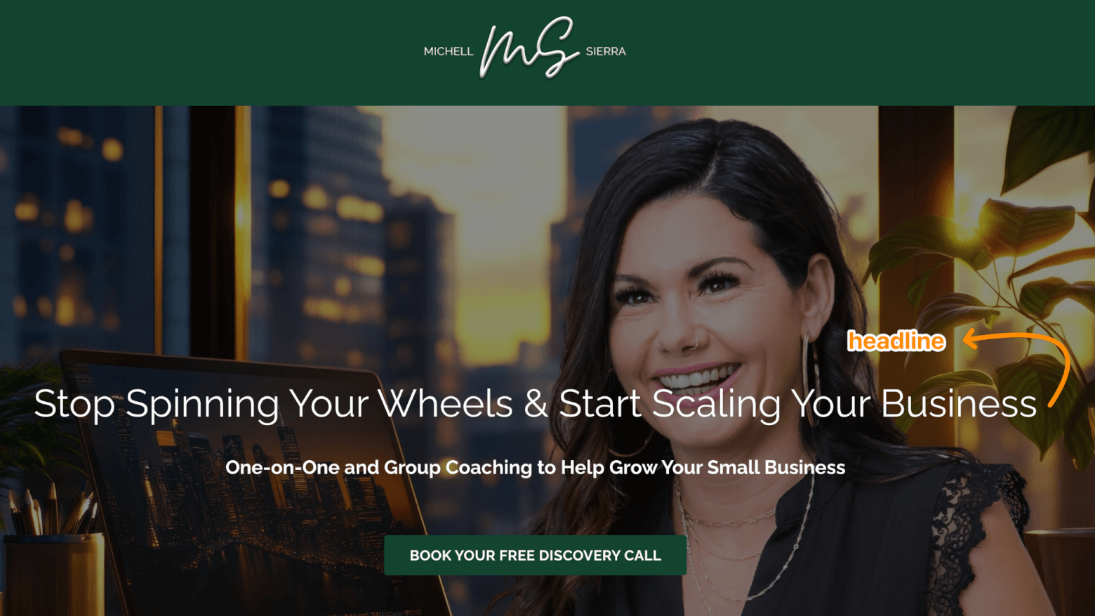
Michelle Sierra landing page
Pro Tip: Psychology-based marketer Sean D’Souza advises staying under 14 to 16 words.
A supportive subheadline
A great subheadline expands on your offer, reinforces your core message, and adds to your headline.
If your headline leans on emotional appeal, like Michelle Sierra’s, it might not explicitly state the offer. Your subheadline comes in handy here. Use it to add clarity, not to repeat information:
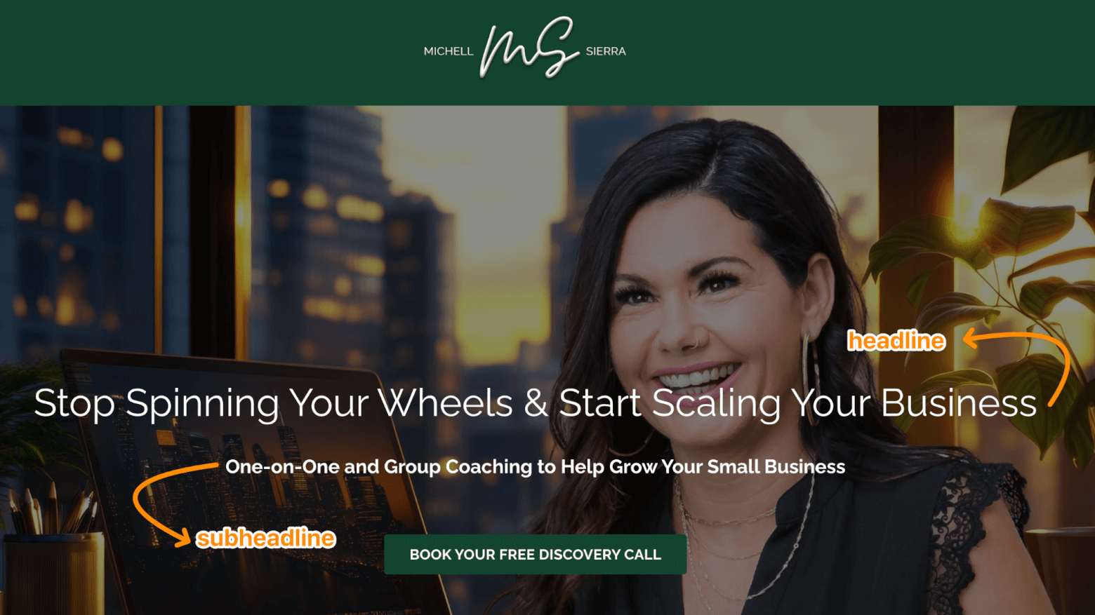
Michelle Sierra's ad landing page headline and subheadline
Punchy headline? Let your subheadline balance it out by making the offer crystal clear.
Customer-focused copy
The body of your landing page should revolve around your audience’s needs, goals, and pain points. Talk about the benefits of your services or products and how they are designed to solve their concerns.
Keep a conversational tone to make it inviting and easy to read. B2B SaaS marketing expert Laith Wallace of FlowConverts has some useful tips:
What’s their biggest problem?
What’s their dream outcome?
Use their words, not corporate jargon. “
(Source: LinkedIn)
Pro Tip: If your landing page is linked to an ad, use the same language to avoid confusion and deliver the message well.
A strong and relevant call-to-action (CTA)
Call-to-actions (CTAs) leave readers with something to do to solve their problem or fulfill a desire. Depending on the length of your landing page, you might include one to three CTAs—but they should all drive toward the same action, same result, just in different ways.
Personalization matters. HubSpot reports that personalized CTAs boost clicks by 202%. Tailor the wording to your audience’s specific problem or desired outcome.
And don’t waste space. Every word on a CTA button counts. Start with strong, direct verbs that inspire action.
Here’s are some examples from The Buyer Psychologist Katelyn Bourgoin’s special guide Wallet-Opening Words:
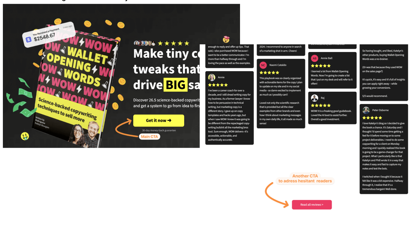
Selection of Wallet Opening Words CTAs
How to Get Your Design and Layout Right
Landing pages need to look good and function well. Don't skip out on the following landing page checklist items if you want to design yours well:
A clear visual hierarchy and clean design
Long landing pages need to flow smoothly, helping readers digest the information effortlessly.
Organize your text and images into columns and use layouts that match natural reading habits like:
- F-shaped pattern: This is best for text-heavy landing pages. Readers first skim across the top, then move down the left side, occasionally glancing right. So, use bold headings, bullet points, and subheadings on the left of the page to grab your audience's attention.
- Z-shaped pattern: This pattern works well for landing pages with minimal copy and a clear CTA. Readers move diagonally down from the top left to the bottom left, and then across again. Keep key messages along the “Z” path so they can be seen in order.
Size, placement, color, and use of whitespace influence how users navigate your page. These elements can all work together to focus the viewer's attention on the most important information and the CTA.
See how we designed a landing page for our website using these very same principles:
Here’s how Wallet-Opening Words enhances the appeal of this course landing page copy with a Z-shaped pattern, varying font sizes, and contrasting colors:
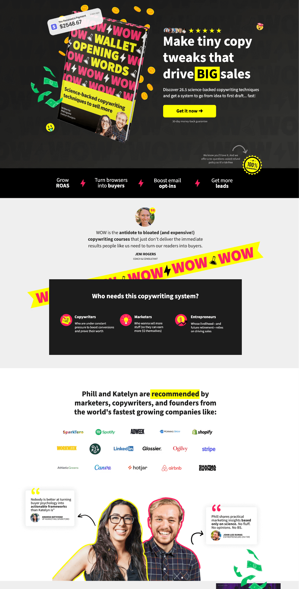
Wallet Opening Words landing page
Pro Tip: For short landing pages like squeeze pages, reading patterns aren't a big consideration since there is very little copy to work with.
A mobile-responsive layout
Some 60% of internet traffic comes from mobile. Optimize your landing page for different devices to ensure mobile users stay engaged.
Free landing page builders like MailChimp offer mobile-responsive templates, so you don’t have to worry about adjusting layouts or resizing elements manually:
Making landing pages accessible and readable on any device can help boost your conversions or, at the very least, reduce bounce-off rates.
High-quality visuals and videos
A picture paints a thousand words, doesn’t it? So, choose the best visual elements that emphasize your landing page's message and are brand-related.
For example: Hero images (if you choose to have one) can portray your offer's value or give a glimpse into what's to come.
Look at how Peloton’s product-focused landing page for their app includes a quick preview of what’s inside it:
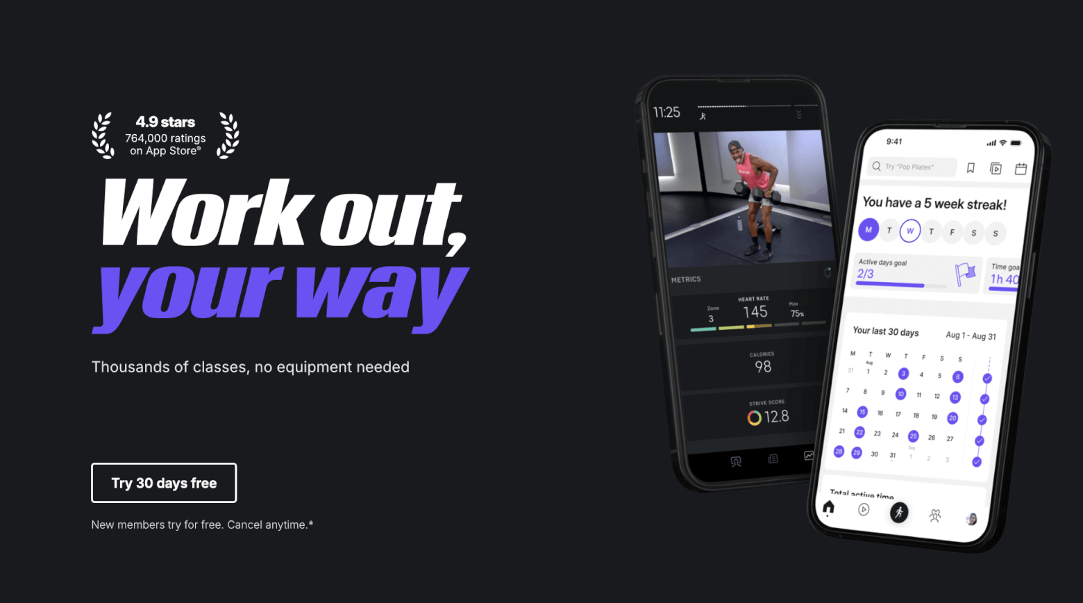
Peloton landing page – hero section
Beyond static images, infographics, videos, and animations also include motion and interactive elements to break up text-heavy sections and convey your message in a more engaging way.
How to Optimize Forms and Conversion Elements
Sprinkle in the right elements for higher conversion rates. Tick off these landing page checklist items to get there:
Essential form fields
Form fields are the input boxes where users enter their information on a landing page.
When designing your form, only ask for the details needed to accomplish your conversion goal. For example:
- Email address for newsletter sign-ups
- Shipping details for checkout forms
- Job title for B2B lead generation
That said, keeping only the essentials doesn’t necessarily mean less is more.
Unbounce conducted a simple experiment to reduce nine form fields to six in order to increase conversation. However, the opposite happened. This move lowered conversions by 14%.
Lesson learned? If you’re removing form fields that readers engage in, you’re only hurting your landing page.
For longer forms, there are always smart ways to hack it. For example, you can set certain fields to auto-fill information to bump up conversions by 25%.
Or you can also create multi-step forms for better engagement like this squeeze page from The Ecomm Manager:
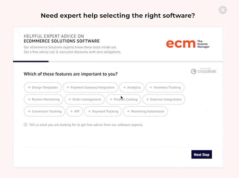
The Ecomm Manager's squeeze page
Catchy CTA button design
People skim long landing pages, so your CTAs need to be visible and hard-to-ignore.
You can play with contrasting colors or use special effects like hover animations or microinteractions. Just don't go overboard.
Strategic placement is also important. Above the fold and bottom of the page are common areas to place your CTAs.
However, you can also try sticky and scroll-down CTAs that always appear, no matter where the reader is on the page. Or why not combine both, like London Business School did for this course landing page?
Smart, authentic urgency or scarcity tactics
To boost conversions, include real-time elements to trigger FOMO (Fear of Missing Out). Here are some examples based on different landing page types:
- Ecommerce product page: Stock indicators (“Only 12 items left!”)
- Course landing page: Countdown timers (“Early bird pricing ends in 5 hours!”)
- Live events registration page: Number of spots booked (“87 people have already secured their seats!”)
Make sure your urgency tactics are transparent, data-driven, and relevant. Fake pressure tactics will only hurt your credibility.
Reassuring trust signals
Trustpilot found that 98% of consumers could identify at least one trust symbol that increased their likelihood to make a purchase. One example they provided is social proof, which can take various forms.
Here are some ideas based on different landing page goals:
- To attract newsletter sign-ups, mention your subscriber count (“Join 50,000+ marketers) or a review from an industry leader.
- To amplify product features, display customer reviews, press coverage, and certification logos.
- To promote services, courses, or high-ticket items, share your case studies, success stories, or industry awards.
Trust symbols also include money-back guarantees, a clear privacy policy link about data security, and seals of approval (SSL security badges, BBB accreditation) to reinforce credibility and guarantee customer security.
How to Improve Performance and Usability
Speed, accessibility, and seamless navigation all contribute to the effectiveness of your landing page. Check these boxes to optimize yours:
Fast loading speed
On average, it takes 2.5 seconds for desktop pages and 8 seconds for mobile pages to show up.
If you can do it faster for your landing pages, you’re more likely to retain interest and lower bounce rates.
Use free tools like PageSpeed Insights and Pingdom to determine how well your landing page is doing.
If you have an image-heavy landing page, optimize it with lazy loading. This technique ensures images only load when they’re needed, reducing loading times and improving user experience.
Accessible design
AudioEye reported the following alarming findings:
- Only 56% of images are accessible to people with impaired vision
- 64% of page links aren’t clear to people with visual or cognitive impairments
- 25% of forms are missing clear labels
Make sure your landing page doesn’t fall into these traps by providing alt text for images, labeling form fields well, and making sure you use descriptive link texts.
Use tools like WAVE and Accessibility Checker to assess landing page accessibility.
Clear error messages for form validation
No matter how well-labeled your forms are, visitors may still enter incorrect information. Guide them by providing concise and user-friendly error messages so they can place the right one.
Freshworks’ demo landing page provides a good example:
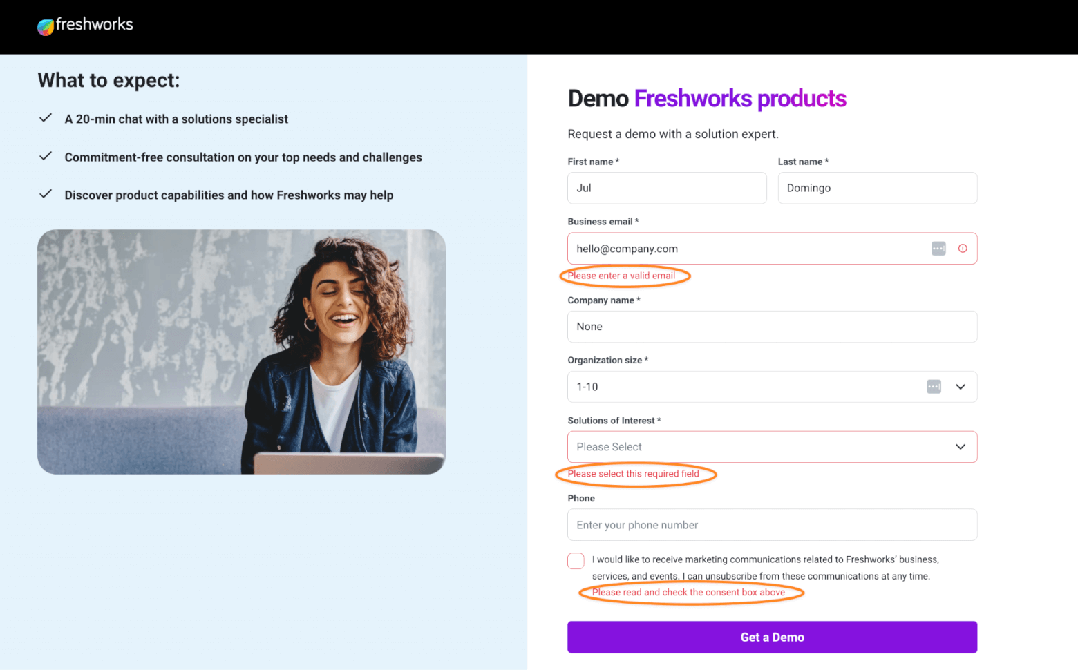
Freshworks lead generation landing page
How to Incorporate Testing and Optimization
Improve your landing page performance over time. To conclude this landing page checklist, follow these measures:
Cross-browser testing
Your landing page should be compatible with all major browsers, like Google Chrome, Safari, Microsoft Edge, and Firefox. Test for design inconsistency and slow-loading content using tools like BrowserStack.
A/B tests
Headlines, CTAs, and layouts—any element that directly affects your landing page’s conversion rates should be tested.
Follow these best practices for A/B testing:
- Examine one element at a time to determine what makes a difference.
- Split your audience evenly between the original version (A) and the modified version (B).
- Collect enough data before making changes to your page. Too soon, your results might not be accurate.
UTM parameters
UTM parameters (or UTM codes) track where your clicks are coming from and which campaigns are performing.
Add them to the URL to provide detailed insights into traffic sources, ad performance, and user behavior.
To show you what it looks like, if you click on this Google ad for “business coaches in Los Angeles”…
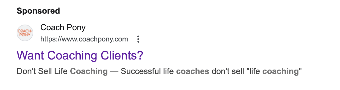
… you’ll be redirected to this URL :
“https://coachpony.com/pay-for-life-coaching/?utm_source=google&utm_medium=cpc&utm_campaign=soi-3&utm_term=coaching%20business&gad_source=1&gclid=CjwKCAjwvr–BhB5EiwAd5YbXqCE58gUzbxR0VG750GItvyDhGjDJnS2Q6IN69sK7tj4R0DolvuvJhoCKy4QAvD_BwE”
Each tag tracks unique information. Here’s a breakdown:
- utm_source=google → Traffic source (Google)
- utm_medium=cpc → Marketing channel used (paid search)
- utm_campaign=soi-3 → Name of the specific campaign
Use a UTM builder like Google’s Campaign URL Builder to create clean, trackable links for better insights, and Google Analytics to track the results.
Deliver Effective Landing Pages Every Time
This landing page checklist is designed to make your life as a marketer easier. Save it to your Bookmarks folder to create high-quality landing pages whenever you need to.
Now that you have the right strategy to create great landing pages, you need the right tool to execute it.
Read the following landing page builder reviews to get an overview of the best platforms on the market.
- The Best Landing Page Builder Top 10 Tools on the Market
- Best Free Landing Page Builder in 2025: 16 Top Options
The authors
Learn more about us

We keep our content up to date
24 Mar 2025 - Added video walking through landing page design principles
Our Methodology
This article has been written and researched following our EmailTooltester methodology.
Our Methodology